Good Design and Good Gameplay
Well Today I have some cool nuggets but also some thoughts on design and also a cool game I found recently.
So the other day I stumbled upon a really awesome Q-R code generator. However, what impressed me the most wasn’t the functionality of the website or tech but the design revolving around it’s marketing.
Check it out here
http://www.qr-code-generator.com/
The Website details pretty clearly everything involved in the usage and inner workings of their QR code generator website.
It has brand cohesiveness, some nice illustrations, but also tightly explains the importance and role of design.
However, it breaks a rule of design. I’d heard it said before that you either show me or tell me but don’t do both at the same time.
So is the rule wrong or are the designs for this website wrong? Well the answer lies in the facts of something different. While someone might say not to do both I think that if done properly showing and telling can be more powerful than one might think.
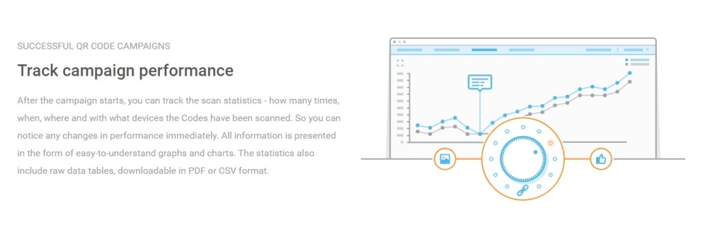
Here are some images to demonstrate.
As one can tell the designs cohesively mesh together quite well creating a sort of symbiotic relationship between text and imagery. Yet, why has this worked here while previously it may not have. While it really comes down to the newest trend: flat design.
With the onset of flat design one could say that because of it’s emphasis on minimalism and and lowering of the visual planes from a 3D visual aspect it gives less for the eyes to look at thus allowing for you to both show and tell at the same time without them distracting from each other.
I find it fascinating especially because this is sort of a response to the move to flat design and the cons and pros that it brought with it. With flat design you received much better clarity of message and cleanliness of look and brand. However, you lost interest or pazzaz and things started to look to corporate or sterile in some senses. While there is nothing wrong with that some people have gone different directions in solving these drawbacks. For example in the mobile world we see a lot of motion and movement in the world of flat UI design. Meanwhile in static webpages while motion is capable sometimes utilizing this technique offers nice incentives.
I think this is incredibly interesting however I’d love to see where this eventually heads.

I’d thought I’d throw in another little nugget just for the sake of sharing.
Kingdom is a pretty new indie developed game that I’ve enjoyed see getting press and also review success. However, what most intrigues me is it’s gameplay. The design of Kingdom is that you are the King and you pay your minions to do your work for you. However, this is done with a twist. Rather than simply have them help you defeat the monsters in the forest they are your arms and feet so to speak. In fact besides paying for buildings and training and weapons you cannot directly interact with any of the enemies by attacking them or even directly interact with the environment.
It’s an interesting concept on the idea of managerial testing in the form of good gameplay and makes of some interesting scenarios.
If you’d like to check out a cheap game on steam this is the game to try out and it’s relatively short and quick to play.
– BW


